Redesigning our website for more consistency and accessibility
After bitegra solutions won the Splash Award Switzerland in several categories in the fall of 2020 and even celebrated the overall winning across all categories, it was time for the redesign and the visual and user-friendly upgrade of our website.
The challenge
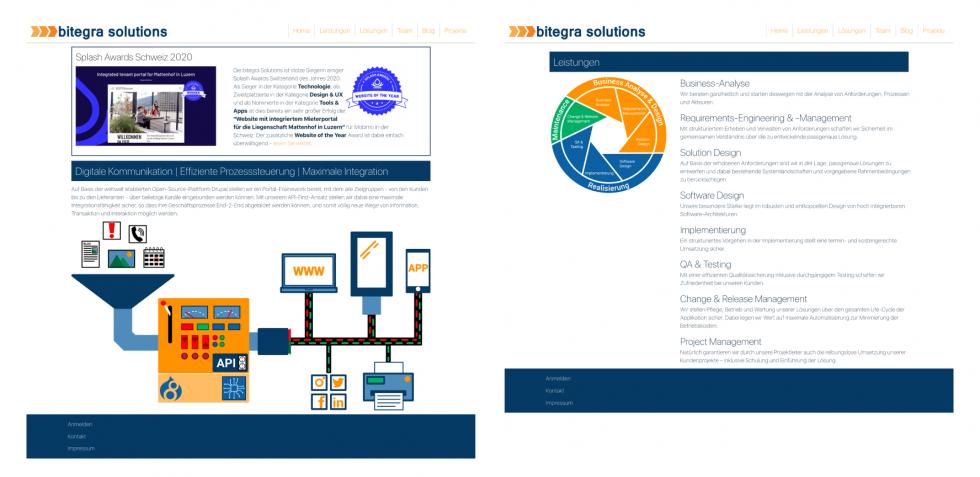
At the time, our existing website was created without the help of a designer. As a result, the information was presented without a specific visual style or structure. The potential to improve the look and feel of our website and make navigation easier and more accessible was very high.

From old to new, virtually no stone was left unturned and we started completely from scratch as far as the conception of our website is concerned. In the following the executed steps are shown and explained, that you too can make a successful redesign of your website. bitegra solutions is an expert in the field of digitalization and in the construction and operation of digital solutions. Therefore, please do not hesitate to contact us.
Design Principles
At the beginning we analyzed the previous state of the website and fixed some potentials that we want to use in the redesign. Inspired by Don Norman’s Principles of Interaction Design and Dieter Rams timeless commandments for good design we envisioned our own design principles. This part of the design process has to be done in a very disciplined way, because in the following everything will be derived from this analysis. So we focused on the following aspects in particular:
Conception & Wireframing
With these guidelines in mind, we designed a first prototype, which was then tested by several user testings of selected personas. We incorporated the feedback collected in the user testing into our prototype until we had designed a first alpha version of the website.
With the extensive findings from the alpha version, we then created a beta version of the design, which was again validated through user testing. Through several rounds of feedback, we approached the final beta design, which met user needs exceptionally well.
Visual design
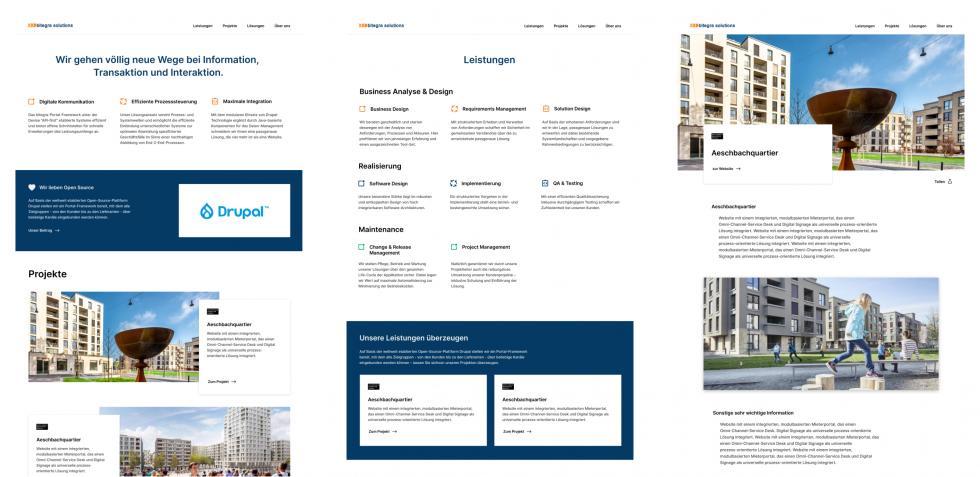
Based on the very mature results of the beta design, this design draft was then fine-tuned through minimal improvements and selected as the final design in a selection process based on the guidelines defined above.
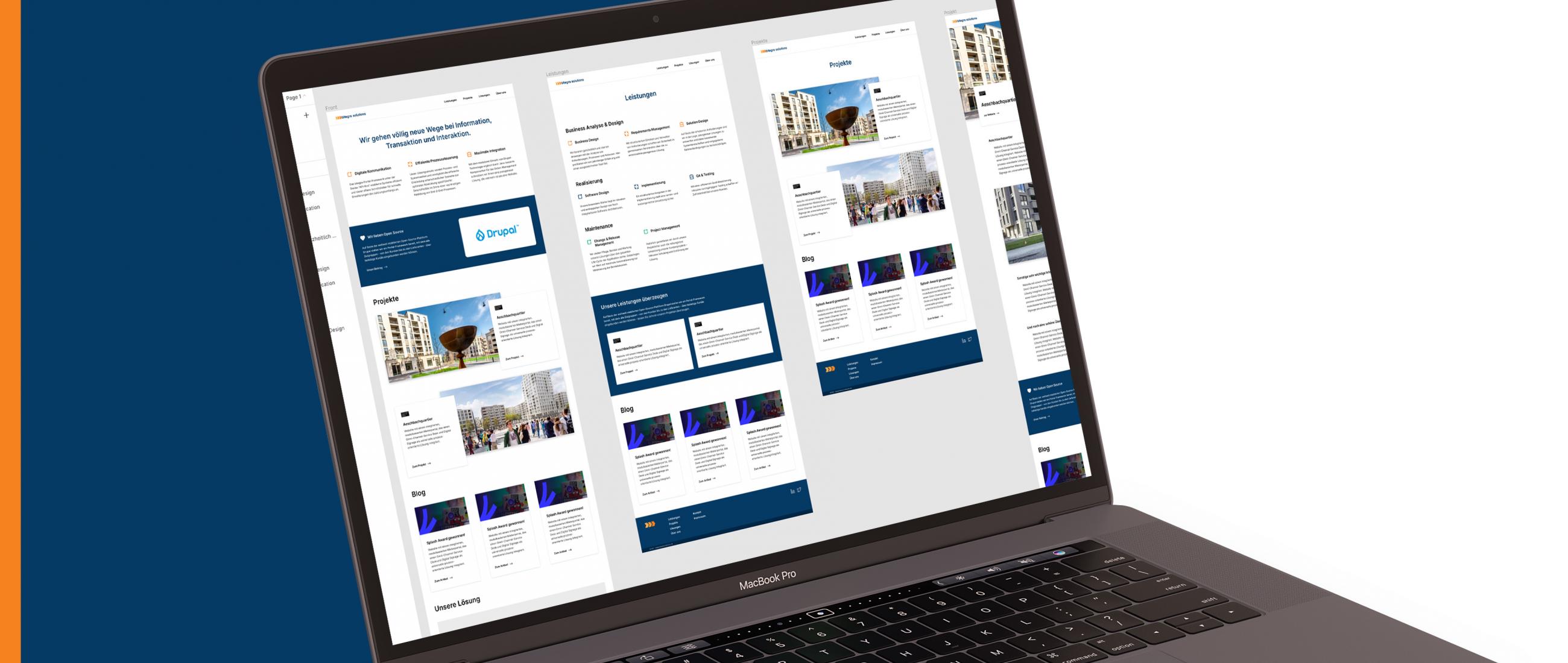
Design implementation and iteration based on the Figma design tool allowed us to move collaboratively and quickly into implementation and to make decisions efficiently based on a unified decision-making basis. In addition, Figma provides an optimal designer - developer workflow that involves the developer in the design processes.

Site Building and Theming
The old Drupal 8 site was updated to Drupal 9 with regard to the redesign, which was fully automated. The strength of Drupal was again confirmed in this task, as the update went completely smoothly and the complete content structure of the old site could be adopted 1:1. Here, countless open source components are used, which extend the basic functionality of Drupal, such as the Gin Admin Theme or the Twig Tweak module.
With the very extensively designed pages and components of the website, an Atomic Design Pattern was then implemented for the styling including a style guide, which allows for high maintainability and at the same time scaling without any problems. With the help of the newly released Bootstrap v5, we used state-of-the-art frontend architecture and were able to implement our design faster than usual.
We are proud to start 2021 with this beautiful redesign and wish all our readers, customers and colleagues a happy new year. We look forward to hearing from you and helping you with your project.
Add new comment